


Canadian Covid Waves
a walking tour of the Bayesian mind

This is long, and coming on a Wednesday. I’ll be doing more Wednesday extras in the coming months. This one is a deep dive into the current state of covid in Canada, which is not good (sorry). If you see “Message Clipped” or similar you’ve run afoul of the Gmail gods. You can still view the whole article on the website.
Fundamentally, this article is about this graph, which I’m putting up front so it’ll get shown on social media. It gets explained down below:
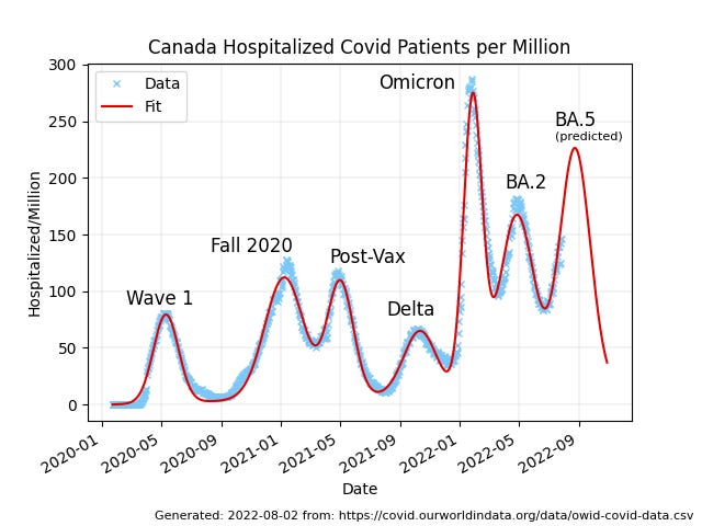
Canadian evolutionary biologist T. Ryan Gregory (@TRyanGregory on Twitter) has posted various versions of this chart of patients in hospital from covid in Canada over the past 2.5 years. The data is from Our World in Data, as is all the other data I’ve used here, and the annotations are his, expressing what many of us in the scientific community have been feeling as we’ve watched this train-wreck crash.
Looking at the data is a sacrament. Meditating on it, wondering about it, asking it questions, and listening with as much humility as we can muster for answers. Data is the source of knowledge. We should pay attention to it.
Unlike a lot of countries Canada’s waves are pretty distinct, and after staring at them off and on for a period of some weeks (because I’m slow that way) I got wondering if they would be tractable as an analytic target, and if so, what kind of analysis would fit into the time I’ve got and yield something interesting to say.
It turns out there is an interesting analysis to be done, and it gives me an opportunity to showcase a bit about how people like me use data to draw robust conclusions about objective reality. So I’ve written this analysis up as a bit of a tour of how I think, in the hope of giving interested non-experts a clearer view of what is involved in this kind of thing.
Preliminaries
Science is more of an art than a science, and part of the art is knowing what kind of mathematical language is likely to be fruitful when asking questions of a given dataset. In the case of Canadian covid hospitalization data, two styles immediately suggest themselves to my artistic mind. One is modelling, where some kind of causal model is used to reproduce the phenomenon in question via simulation. Causes in, effects out. This is hard, although I’ll likely get to it eventually.
The other is fitting, in which some more-or-less empirical curve-shape is fit to the data. This is dangerous and often stupid. The famous “cubic fit” of the early pandemic had no causal justification and led to an absurdly implausible result.
But I’m an experienced analyst, and those peaks look pretty Gaussian, and that’s usually a pretty safe bet. And unlike modelling, fitting is pretty quick and easy. So why not fit now, model later?
A Gaussian is a curve that comes up a lot in the study of random processes, and there is a lot of randomness in the spread of disease. It’s named after the great German mathematician Carl Friedrich Gauss, and is sometimes also called a “normal distribution”.
The mathematical form of a Gaussian is:
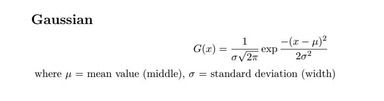
and a typical Gaussian curve looks like:

The normalization factor out front ensures that the area under the curve is equal to 1 in whatever units we’re working in: if the Gaussian represents probability it is a pure number. If it represents people, it is “people*whatever-units-x-is-in” and so on. This means we can simply multiply a normalized Gaussian by a leading factor, A, and that will be the area under the curve.
This fact is going to be very important in what follows, and demonstrate nicely how fitting, if used with taste and good judgement, can be a powerful tool for understanding reality and even—in a very limited way—predicting the future.
So having convinced myself it was worth doing, I downloaded the full covid dataset from Our World in Data and wrote a Python script to pull out the hospitalization numbers for Canada, which gave me a data file that had two columns: the day number (starting from Jan 23, 2020) and the number of Canadians per million population in hospital from covid on that day. The reason for using the number per million population is to allow easier comparison with other countries in future if I want to extend the analysis. For Canada, to get the raw number just multiply by 38.
I believe these numbers are fairly good: it is hard to fake people in hospital, although in my home province of British Columbia the government did try hard by ceasing to report a person who was in hospital due to covid once they were no longer infectious, which is a bit like ceasing to report people in hospital due to cancer once they have had surgery.
In any case, whenever we look at data we should be asking, “How well does it represent the real world, and how much human interference has it be subject to?” In the case of any data collected by government, business, or NGOs, this is likely to be “a lot”, because humans are apt to engage in any amount of desecration and obscenity in pursuit of their own narrow interests and biases. But these numbers aren’t completely terrible, based on what other experts have said about them.
So having a file full of probably-useful numbers, I proceeded to look at them, using the gnuplot program, which is a simple but powerful interactive graphing program that I use for a lot of preliminary analysis of this kind:

Those peaks certainly do look pretty Gaussian. Fitting data to arbitrary curves is often a Very Bad Idea, but in this case there is reason to believe a Gaussian would be a good fit. The spread of disease is generally modelled with a sigmoid function, which comes in a variety of mathematical forms, one of which is the integral of a Gaussian. And the none of the usual deviations from Gaussian shape—bimodality, asymmetry, and heavy tails—look like big problems here.
So I started out doing simple fits by hand just to see if I was completely nuts. It turns out I am not, despite what Mrs Wonders may sometimes think.

It took ten or fifteen minutes to eyeball those curves and see what came out, but it convinced me there was enough substance to the idea that Canada’s hospitalization waves were well-fitted by a series of Gaussians that a deeper look seemed worthwhile.
Fortunately, I had the tool on hand to do the job. For many years complex minimization problems have been a staple of my business, and in working on them I have developed an extremely robust non-linear minimization system that makes problems like this easy. This work motivated me to clean up the Python version a bit and make it available on the Python Package Index site.
Fitting the Data
Fitting a curve to data involves finding the curve parameters that minimize the difference between the curve and the data you are trying to fit. The whole point of fitting is that curves are generally described by a small number of parameters. A Gaussian has just three: the mean, the standard deviation, and the area factor out front.
The useful thing about such a fit is if there are six peaks with three parameters each there are a total of 18 parameters, although I added a 19th to represent linear growth of endemic cases, just to see what it would look like. Nineteen is a much smaller number than 913, which is the number of points in the dataset, and the numbers are conceptually meaningful in a way the raw data are not, which makes the data—and the world—easier to reason about. The whole point of this exercise is to make the world easier to reason about.
The fit consists of a dozen-odd lines of Python code that find the 19 parameters that minimize the difference between the data and a fit function consisting of a sum of six Gaussians plus a simple line with an intercept fixed at zero. The line might be thought of as representing the “endemic” part of the fit: the part that does not involve waves, which are outbreaks on top of the linear background. This is not really what “endemic” means, but many talking heads in Canada have been going on about “covid becoming endemic” as if that meant “no more enormous waves that wipe out health care, kill hundreds per month, and cause long-term disability in a few percent of the population” so that’s how I’ve been thinking of it.
The actual thing being minimized is called the “objective function”, and is a function of the fit parameters:

That is, we take the sum of the squared difference between the data and the fit over all the days we have data for, then divide by the number of days to to get the average, and take the square root. This is called the “RMS error”, where “RMS” means “root mean squared”: we take the root of the mean (average) value of the squared error. The RMS error has some nice properties. It should have a value not too far from 1 (in this case it’s about 8, which is pretty good given how limited the model is) and near the minimum it tends to look like a parabolic function of the parameters, which is a nice friendly surface to minimize on. The reason we want it close to 1 has to do with how computers represent numbers. Very big and very small numbers and result in annoyances best avoided.
In Python, the nice compact mathematical representation of the objective function becomes a bit more verbose:
import math

...initialization...

def __call__(self, lstX):

  # lstX has structure slope, peak1, pos1, width1, peak2, ...

  fError = 0.0
  for nDay, fValue in enumerate(self.lstData):
    fError += (self.fit(nDay, lstX)-fValue)**2
  return math.sqrt(fError/nDay)

def fit(self, nDay, lstX):
  fFit = lstX[0]*nDay # start with slope
  for nPeak in range(1, len(lstX), 3): # add peaks
    fFit += self.peak(nDay, lstX[nPeak:nPeak+3])
  return fFit

def peak(self, nDay, lstPeak):
  return lstPeak[0]*math.exp(-(nDay-lstPeak[1])**2/lstPeak[2])
The six-peak fit works very well for such a simple model. This means the idea “Canada’s covid hospitalization data can be fit by a series of Gaussian peaks on a slowly growing linear background” is a good one:

To get a sense of how good the fit is (RMS error of 7.96) we can plot the percentage difference and see that the big errors are all where the number of people in hospital is small, as one would expect. A model designed to fit peaks is not going to do all that well in between peaks.

Looking at what the error is and where the error is should be a routine part of any data analysis. Even though the fit “looks good” it’s always worth asking if we can visualize it in a way that is likely to bring out any latent issues. American physicist Richard Feynman said we are the easiest people to fool, and he was not wrong.
Predictions
Now this is where it gets fun, because as can be clearly seen, there is a seventh peak rising in the data right now. Can we fit it and get some prediction of the future? Normally people use tarot cards and horoscopes for that, which don’t work. Will this?
Adding a seventh peak to the minimizer is easy, and produces impressive, depressing, results:

As can be seen, the current wave of covid hospitalizations in Canada has not yet peaked, and it will be higher than the previous wave. The peak will probably occur on August 24th or thereabouts. So already we have a glimpse into the future. It’s nothing like “100% certain for sure”, but then again: nothing is.
Some information is better than no information, and this is definitely information. A lot of things would have to be wrong for the prediction “the current wave of hospitalizations will peak in late August, likely close to August 24th” to turn out to be wildly off.
I’ve fit the peaks in terms of things I’ve called “peak”, “position”, and “width”, but the interesting values are “area”, “position”, and “standard deviation”. Referring back to the equation for a Gaussian, my “width” parameter is related to the standard deviation by: SDev = sqrt(width/2), where the resulting value is in days. This is useful because we know that for a Gausian peak, +/- 1 standard deviation around the position of the peak contains just over 2/3 of the area of the peak, and +/- 2 standard deviations contains 95% of the area, so a 30-day standard deviation is a wave where the bulk of the cases happen over two or three months.
Similarly, the area of a peak, which represents “person-days in hospital per million Canadians” is given by: Area = peak*sqrt(2*pi)*SDev.
This lets us turn the fit parameters into meaningful values that can help us reason about the state of the pandemic.
The parameters of the various peaks are as follows, not in a table because substack doesn’t yet support tables… instead I’ve formatted it as a “poetry block”, which is kind of poetic:
Wave     Date          Day    SDev   Area
  1     2020-05-11  109.20  25.63    5006.0
  2     2021-01-07  350.70  39.82  10709.3
  3     2021-05-02  465.16  26.62    6779.4
  4     2021-10-11  627.93  33.36    4704.7
  5     2022-01-27  735.73  18.92  12260.2
  6     2022-04-27  825.78  35.38  13824.3
  7     2022-08-23  943.88  31.30  15898.0
There is a lot of useful information in these parameters. Notice for example how the omicron wave had a high peak because it was half the average width—18 days instead of ~30—but lower area than the BA.2 peak that followed.
One thing I was curious about was if the peaks are getting closer together, but there are too few of them and the gaps are too variable to say much about trends.
About our current reality, though, we can say that the last few peaks have been very close together: an average of 105 days between peaks, and not a lot of variability: 118, 90, and 108 days are the gaps since delta. On that basis we can expect the post-BA.5 peak will come in early December, likely close to the 6th, if this keeps up, and why wouldn’t it? It might not, but “the future will probably be a lot like the past” is a statement no Bayesian would quibble with.
The area numbers I’ll come back to below, but before that I want to infer something immediately useful about the likely state of covid cases in Canada today. Now, this isn’t something we should have to do any analysis to figure out—we should be able to just go to a government website and get a report on the current case count—but Canadian governments abandoned testing as our health care systems started to buckle under omicron, so our human right to the data that should be used to inform policy is being violated. Even so: you can’t stop the signal. Knowing hospitalizations in the future allows us to look back into the present.
The case data in Canada are a bit of a mess, with a strong weekly structure because our government data handling people lack the competencies to set up an automated pipeline that would run without human intervention. Nevertheless, we can fit the first five peaks using the same procedure as we did for the hospitalization data. Although the data are noisy for omicron as the health care system started to collapse, the fit is good:

Wave   Cases Peak    Hospitalizations Peak   Difference (Days)
1           2020-04-23        2020-05-11                            18.2
2           2020-12-20        2021-01-07                            18.5
3           2021-04-19        2021-05-02                            12.3
4           2021-09-21        2021-10-11                            20.3
5           2022-01-07        2022-01-27                            20.5
The median difference is 18.5 days: hospitalizations lag cases by about two and a half weeks.
We can say on that basis that cases in the current wave will peak on Friday of this week, August 5th. As I said, it’s crazy—and a human rights violation—that we have to go through this kind of exercise to have any idea of what is happening RIGHT NOW, but thanks to the incompetence and venality of our governments, we do.
Our complacency as citizens has to carry some of the weight as well: governments do what they think they can get away with. In a democracy, they can get away with what we let them get away with.
We are letting our governments get away with murder: Canada has had 12560 covid deaths so far this year, 6145 of them in the past five months, since the end of the omicron wave. At that rate (6145 deaths in 153 days) we can expect another 6063 deaths by the end of the year, for a total of 18623 dead Canadians in 2022.
Influenza in the last full flu season (Sept 2018-August 2019) killed 224 people in Canada, making covid over 80 times more deadly than the flu.
Just a cold, eh?
There were 14442 covid deaths in all of 2021, and 15672 covid deaths in 2020 across Canada.
18,600 deaths in 2022 is bigger than 15,600 deaths in 2021 which is bigger than 14,400 deaths in 2020… so any claim that covid is getting milder in Canada is a lie.
Because I’ve already got a load of graphics here, let’s look at deaths graphically before getting into the other measure of severity this analysis gives us.

I’ve included Canadian 2018 flu deaths for scale. See that yellow line way down at the bottom of the graph? That’s the flu. See those big fat purple boxes? That’s covid. If you think these look like each other, please: seek help.
The line fit is completely unjustified, except by the observation that the three points do actually fall on a pretty straight line. There’s no reason to believe the extrapolation into 2023 is accurate, but then again: there’s not much reason to believe it isn’t, either.
Why would a disease that has killed 10-20% more people each year for the past two years NOT kill more people next year? Viral evolution for covid, as we have seen, elaborates on a scale of months, and shows no sign of slowing down, although human authorities have stopped using new names for clearly distinct variants.
Wave Severity
Let’s have another look at the table of parameters that describe the hospitalization waves in Canada. I’ll repeat it here for convenience, with one more column:
Wave     Date          Day    SDev   Area      Person-Days
  1     2020-05-11  109.20  25.63  5006.0        190,228
  2     2021-01-07  350.70  39.82  10709.3      406,953
  3     2021-05-02  465.16  26.62  6779.4        257,617
  4     2021-10-11  627.93  33.36  4704.7        178,778
  5     2022-01-27  735.73  18.92  12260.2      465,888
  6     2022-04-27  825.78  35.38  13824.3      525,323
  7     2022-08-23  943.88  31.30  15898.0      604,124
The Area parameter is in person-days hospitalized per million Canadians. There are 38 million of us, so I’ve multiplied the Area by 38 to get Person-Days in hospital for each wave. There are about 20 million working Canadians, so even the smallest waves represent a 1% reduction in the workforce due to people in hospital, and an even larger reduction due to people off sick.
Isn’t it odd there are staffing shortages everywhere right now? Expect them to get worse.
The number of person-days in hospital is a particularly interesting number because it’s a measure both of the human misery (and economic hardship) caused by acute covid, and a measure of the strain on our health care systems. The eye is drawn to the height of the peak—which is not irrelevant—but the area is a much better measure of the broader consequences of a wave.
Every one of those hundreds-of-thousands of person-days in hospital represents three nursing shifts.
And if we graph the area numbers, another notable thing about them jumps out: they are not going down.

The graph shows the wave size in Person-Days Hospitalized per million Canadians. The linear fit is again purely heuristic: there is no causal model behind it. It’s just an empirical trend-line. The slope of the line is, however, within the limits of the data, robustly positive, and if we cherry-pick the omicron variants (all of three points) it is even steeper, and a better fit, than the overall line.
I’m generally conservative about drawing conclusions from data. The Star Trek style of jumping to conclusions—“But Captain, if THAT’S the case the cause must be THIS!”—makes for fine fiction but bad science and even worse politics. One of the foundational principles of good data analysis is maximum entropy, which in simple language means: don’t believe anything the data doesn’t force you to believe.
As a Bayesian I hold heuristic trend lines with a good deal of skepticism, and you should too. Extending them a little bit into the future is OK, but once you get past the average distance between the points you’re fitting they are very suspect. Low-order fits, like this line (two parameters: slope and intercept) are less likely to go wrong than anything higher order. In general, anything over 2nd order is wrong: it is almost certainly fitting some admixture of noise and wishful thinking.
So with those caveats: two measures of covid severity—deaths and person-days in hospital—both show robust and significant upward trends when subject to a minimal (linear) fit. And that’s before we look at Long Covid, which is way outside the scope of this work.
Despite this, our political leaders and their boosters and hangers-on are consistently telling us that the pandemic is over, and we have to return to “normal,” and that current (seventh) wave is the last.
The data are telling us it is far more likely that we will see another wave peaking in early December, and that it will be larger than the current wave. The “endemic” component of the fit in this work is tiny: a slope of about 0.013/day, so even after almost 1000 days it accounts for just 13 hospitalizations per million people, while the waves peak well into the hundreds.
Ten thousand or more Canadians dying of a preventable disease every year, and many more being disabled by it, some permanently, does not fall within my definition of “normal”.
Conclusion
If you’ve got this far: thank you.
I hope you’ve learned something about how a Bayesian looks at data. There’s nothing very explicitly Bayesian about most of what I’ve done here, but Bayesian attitudes pervade it regardless.
If you take away any lessons from this I hope they are along the lines of:
Data can tell us about the world if we treat it with reverence and respect
Even somewhat empirical fitting to functions can be used to generate understanding from data if we approach them with humility
The current wave will very likely peak in late August. The next wave will most likely peak in early December, and more likely than not—given the data we have—it will be worse than the current wave.
Covid is not over. The data strongly suggest it is getting more severe in terms of both deaths and strain on the health care system as measured by person-days in hospital during each successive wave.
Covid is at least 80 times more deadly than the flu, and nothing like a cold.
Our political leadership is getting away with murder, and it’s up to us to stop them.
On that last note, as I’ve asked before: please write your MP, you MLA, your MPP, your provincial health minister, your premier, the Prime Minster. A sample letter follows below the share button, which I encourage you to use.
The covid situation in Canada may get better in future. Right now it is getting worse. We have the power to change that with well-known engineering controls: improved ventilation, improved filtration, universal CO2 monitoring, upper-room UV and far UV systems. And until we have all those: mask mandates for indoor public spaces.
There is nothing mysterious about what we have to do.
All we need is the will, and the leadership, to do it.
Here’s an example letter based on one drafted by Mrs. Wonders. Your postal code is important as it tells them whose constituent you are. The Canadian Prime Minister’s e-mail address is pm@pm.gc.ca, you can find other addresses here: https://www.ourcommons.ca/Members/en
Dear Sir/Madam,
As a citizen of Canada, in particular «YOUR PROVINCE» («YOUR POSTAL CODE»), I would like to add my voice to others who are concerned that premature lifting of mask mandates and an insufficient focus on air quality are causing loss of life from covid that could have been prevented and continues be preventable. Vaccines are an important part of the equation but clearly (according to the data) not sufficient alone.
I ask that you please take concrete action as soon as possible: reinstate public mask mandates, especially in health care and on public transit, and commit to ventilation improvements in public buildings as well as improving building codes to ensure upgrades to all existing buildings. Invest in upper-room and far UV systems and similar technologies.
The fight for clean, virus-free, air in the 21st century is as important as the fight for clean, germ-free, water was in the 19th. What side of that fight are you on?
Thank you,
«Your Name Here»