
On Interpretation (of Data)
Signal and Noise

I’m taking a moment this week to talk about covid instead of human hierarchies, which will be back next week or the week after.
The title of this piece is a riff on Aristotle’s On Interpretation, which I’ve written about before. It is the first philosophical work we know of that deals with the relationship between language, thought, and reality. I won’t be discussing that work in any detail here, but I’ll note in passing that Bayesian epistemology solves the problem of future contingents, which is that the truth or falsity of propositions about the future would seem to be undecidable, or the future is fixed and chance does not exist.
Interpretation of data is more of an art than a science.
It is the business of drawing conclusions about the way the world is based on what we know about it.
What we know about the world isn’t just any old thing. Informal observations mostly tell us about the observer, not the observed. We are creatures of bias and confusion, our heads full of sound and fury, which certainly don’t signify anything about the rest of existence.
What we know about the world is data and natural histories.
Natural histories--which get short shrift in the world of modern science--are thorough descriptions of things based on formal, systematic, observations, recording as much detail as possible with a particular eye for apparent contradictions in the description, which are indicators of error, usually bias. I’m not anything like an expert in natural histories, which tend to be the purview of biologists, although Faraday--the patron saint of World of Wonders--wrote a book for children called The Chemical History of a Candle which must be seen to be properly appreciated. It is something like a natural history insofar as it relies heavily on close observation, albeit with experimental twists.
Although observation plays a significant role in my professional life, my business is primarily data: collecting, curating it, asking it questions, and simply listening to it. The latter is the most difficult. It’s easy to overwhelm the data with the insistency of our questions, the noise of our inquiries.
And it’s easy to see things in it that aren’t there: projecting our hopes, fears, assumptions, and politics onto the data.
The most fundamental discipline of knowledge is silence: stilling the mind and opening it up to what is out there, in the world beyond ourselves.
We have tools to help us do this. Reductionism is a big one, which allows us to grasp parts of the world while still respecting the Fundamental Limitation of human consciousness, which is the truly tiny scope of our attention.
For example, mathematical analysis of the kind I’ve been doing to extract Gaussian peaks from Canadian covid hospitalization data allows us to reduce hundreds of daily data points to just a handful of parameters. We have had eight covid peaks so far, and each peak is well-described by just three parameters: width, area, and position. Dealing with twenty-four numbers instead of almost a thousand is already a huge win for our limited attention, and it gets better: those twenty-four numbers are meaningful in a way that makes them relatively easy to reason about.
For example, I’ve seen the observation made that the troughs between waves are getting shallower, as if we’re headed for some kind of continuous plateau.
I can sort of see where this idea is coming from, just looking at the raw data:

The most recent wave has a very week trough between it and the previous one, and recency bias is a thing.
But if we look instead at the distribution of wave parameters that come out of a reductionist analysis we see a quite different story. Which story it tells depends on the assumptions we make, though.
My feeling when looking at the data is that the omicron era is different from the pre-omicron era. When I started doing this kind of analysis, before wave 7 (BA.5) had fully developed, this was far from obvious. Now we have as many omicron waves as pre-omicron waves, and there are some things that jump out.
The spacing of waves in the omicron era is incredibly regular compared to pre-omicron:

Pre-omicron the spacing varies by a factor of two. Omicron wave spacing varies by about ten percent: the waves are 95 days apart with a standard deviation of just ten days.
On the face of it, this supports the idea “omicron is different”. I pointed this out to Mrs Wonders over lunch today and she correctly identified the confounding effect: during the pre-omicron era our “public health” authorities and the average citizen were still pretending to care about human lives, so waves may have been delayed by effective, low-cost, low-side-effect interventions like mask mandates, paid sick-time, and work from home.
If anyone wants to make this argument they are accepting that masking and the like are more than capable of stopping covid’s general spread, because a wave delayed in a wave denied: there’s nothing to stop us from pushing these waves off into the indefinite future, primarily using N95 masks, while we upgrade ventilation, filtration, and UV infrastructure.
But it does mean that in the case of peak spacing, where there is no question the omicron era is different, we know that there were confounders that might reasonably be expected to delay peaks, and we also know those cofounders--basic public health protections like mask mandates--have been completely removed in the omicron era, which may be the cause of the observed regularity in peak spacing since.
It took two years for the first four waves. We’ve had four omicron waves in 2022.
The question I’m really concerned with here is: what will 2023 look like?
Will we get another series of three, four, or five waves, the next in an endless succession of the same, at least until we take indoor air quality as seriously as we take clean water for white people?
What about the other two parameters: width and area? They whisper softly, but I think there’s a signal to be had.
My early plots of wave area included a linear fit to all the data, which showed a steady upward slope:
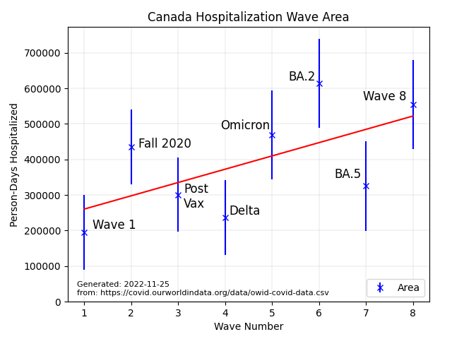
Despite the noise, I was aware that the pre-omicron peaks looked collectively lower than the omicron peaks, and considered the possibility what I was seeing was not a continuously rising slope, but a modal change, with two different levels of average peak area.
Fitting pre-omicron and omicron separately tends to support this idea:

The slope of the line of best fit for both pre-omicron and omicron peaks is practically zero, and zero is a bit of a special number, because it allows me to drop a whole parameter from the fit.
The equation of a line is:
Y = slope*X + offset
But because the slope is zero to a good approximation these data are well-fit with a level, not a line:
Y = offset
Whenever you can get rid of a whole parameter without significantly reducing the quality of the fit, do so.
On this basis the data are telling me, objectively, that the omicron era is different than the pre-omicon era. Again: public health protections could have played a role in blunting the early waves, but on the other hand we know omicron is ten times more infective, so the observed difference in wave area can’t be due only to human action. It must in some part be due to the behaviour of the disease itself.
This is a classic case of Simpson’s paradox, where the difference between sub-populations swamps the difference within each sub-population. If we treat the omicron and pre-omicron eras as a single population, we get constantly increasing wave area, which means more people in hospital with each one. If we treat them as separate populations we can see there is a constant level within each, and expect omicron waves to continue on as they have been, with about half a million person-days in hospital each wave.
I lean toward these being two separate populations because constancy is quite literally simpler in the objective sense of something called Kolmogorov information, which I’ll talk about some other time. But I could be wrong. It’s happened before.
Finally, there is the wave width, which pushes us in the other direction: the width is a nice flat line if we look at all the peaks together:

But if we look at the eras separately we get widths that increase with time:

This is a problem, because I’ve argued above that we should favour constancy, which for areas implies the two eras are different, whereas for widths the same principle implies the two eras are the same. This is made worse by the fact that the first omicron peak was incredibly narrow due to the high infectiousness and low avoidance that it came with. And is there a seasonal pattern here, with winter waves being narrower? We don’t have enough data yet to tell. In another two or three years we will.
So which is it? Are the eras different or not? And are they different in all parameters? Maybe something in the underlying dynamics affects spacing--which could also be shifted by public health interventions, if we were doing any--and areas, but not widths.
I’m going to have to think more about this, particularly with respect to the underlying dynamics.
Interpretation of data is hard.
I’ve tried here to show some of the pitfalls one can fall into. Over-interpretation is at the root of a lot of them, but without some willingness to make plausible assumptions the data may remain silent.
I’m deaf--I can’t function without hearing aides in most situations, and even with them I’m useless in a lot of cases--but get along pretty well most of the time by picking up enough context and filling in the gaps. It doesn’t always work, though, which results in my hearing apparently bizarre things: imagine an ordinary conversation interspersed with a smattering of misheard song lyrics.
I still get along pretty well because I make a lot of assumptions about what people are saying, and I’m right often enough to “hear” them even though I don’t hear them.
In the case of data like these, I don’t have decades of experience and huge amounts of prior information to fall back on, and as such any assumptions I make are weakly justified at best.
Because I know omicron is far more infectious than previous variants, and demonstrably capable of re-infecting due to immunity waning in the month or two after people recover, I tend to lean toward the idea that we are looking at two eras in these data. That implies constant area, constant spacing, and--maybe--slowly growing width. The “maybe” is there because the first omicron wave was really anomalously narrow, and that is where all the observed slope is coming from in the omicron era.
It won’t shock me if the wave widths continue to grow, so we slowly get a plateau of a high level of infection. It also won’t shock me if widths remain roughly constant at around 30 days, so we get a continuous series of distinct peaks.
Regardless of the specifics: until we start wearing N95s indoors in public and in crowded outdoor places while we upgrade or install ventilation, filtration, and UV systems, covid will continue to kill people at the rate that has made it the third leading cause of death in 2022, and covid will continue to leave many times that number permanently disabled.
Great article, Tom. It’s astounding how almost everyone has turned a complete blind eye to this disease that is still here and still killing and incapacitating so many.
Thanks for a very enlightening article about how to tease out information from data. My undergrad degree was statistics though hardly ever used it once I transitioned to a career in IT. This gives me some insight into how I might have approached the world had I instead pursued a stats-based career.