
On Omicron
an unfortunate extra

Normally World of Wonders publishes on Friday mornings, and will continue to do so. This is an extra post on the omicron variant of covid-19. Which is worldwide, but not so wonderful.
I am a physicist and engineer whose last academic appointment was as an adjunct professor in Pathology and Molecular Medicine at Queen’s University in Kingston, and whose consulting work has included a wide variety of academic and corporate biomedical research projects. I’m writing here in my capacity as an expert on data analysis, disease, and predictive modelling.
Omicron has hit the world with shocking speed and I thought it worth sending out a few brief notes on our current situation as the holiday season is here and a lot of people will be traveling.
There are two salient features of omicron that have had a lot of press: infectiousness and severity.
It is easy to be misled by headlines that tout omicron as a "mild" disease, and it's particularly important to examine carefully what that means in the context of how infectious it is.
The only big study on severity of omicron is by Discovery Health on the situation in South Africa.
This study has been getting a lot of headlines along the lines of "South African Study Shows Omicron is a Mild Disease".
These headlines are lies.
What the study actually says is: "The risk of hospital admission among adults diagnosed with COVID-19 is 29% lower for the Omicron variant infection compared to infections involving the D614G mutation in South Africa’s first wave in mid-2020, after adjusting for vaccination status".
A 29% reduction in risk of hospitalization relative to previous variants. [Edit: a friend asked what “after adjusting for vaccination status means”, and I’ve added an appendix to this post explaining it.]
That means that if 100 people would have gone to hospital with a previous variant, 71 would do so if it was omicron.
Better, yes.
But there is no way that the categorical term "mild" can reasonably be applied. "Very slightly milder" is the best one could do. In my work both as a clinical scientist and as an engineer involved in optimizations, I target factors of two as significant changes, because it's only when things change by that much that people really start to notice. Anything less is a marginal change. So "marginally milder" would also work in this case.
Unfortunately "marginally milder" is paired with "vastly more infectious". The current doubling time of omicron in Ontario is 2.3 DAYS. Other jurisdictions have put it between 2 and 3 days.
To see what that means, consider the situation in my home province of British Columbia (BC), Canada.
There are about 100 cases of omicron in BC right now. There were 44 confirmed yesterday and BC is terrible at testing, so we're missing at least half.
It's December 15th at the time of this writing.
With a conservative doubling time of 3 days, that's:
200 new cases/day on December 18th
400 on December 21st
800 on December 24th
1600 on December 27th
3200 on December 30th
6400 on January 3rd
12,800 on January 6th.
Exponential growth will not continue forever because we'll eventually run out of bodies to infect. This is not a reassuring thought.
The data we have up until a couple of days ago in BC look like this, where the yellow line is the best-fit exponential, which has a large error but comes in with a doubling time of about 2.23 days, comparable to what is being observed in Ontario where they got off to an earlier start. For context, the data shown here begin on day 548 in my reckoning, which was July 1st, 2021, when our Public Health Officer prematurely removed the provincial mask mandate because she lacks a number of the basic scientific competencies necessary to do her job:

During the peaks of previous waves BC hit around 1000 new infections per day, which is 200 new cases per million in our province of 5 million people.
We'll reach that number on Boxing Day... if it's a 3 day doubling time.
If it's 2.23 days--the current best fit in BC--we'll hit that level next Monday, which is day 720 on my graphs, which start numbering days from January 1st 2020:
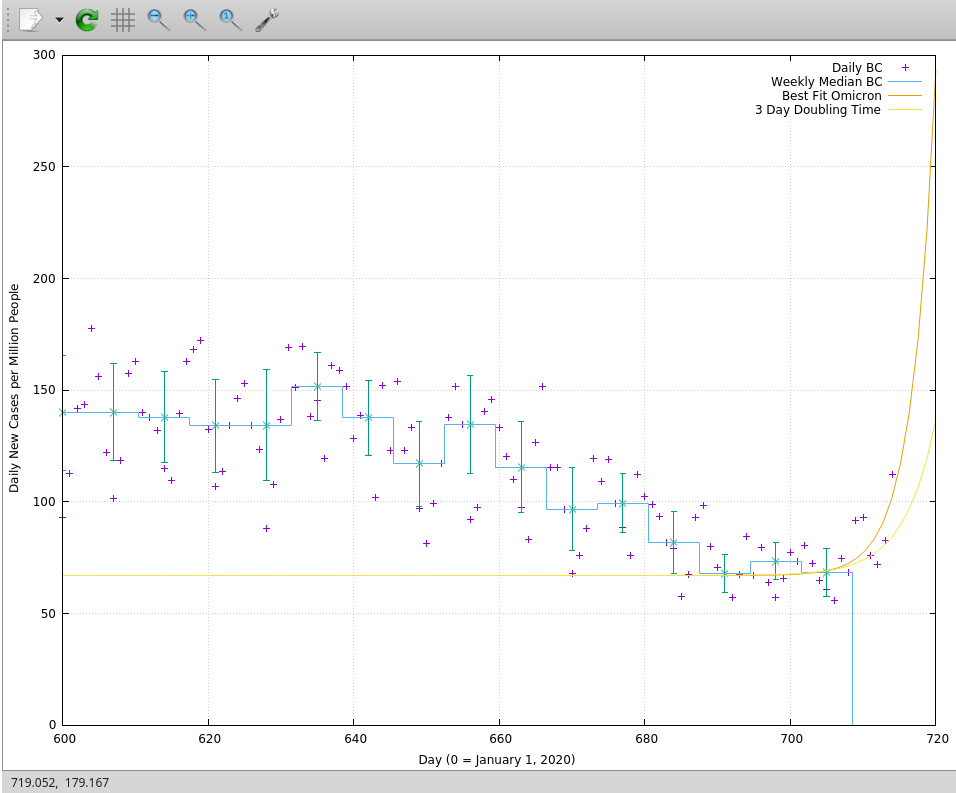
To get more detail where it matters, I’ve cut the data off on the low side at day 600 here, which is two weeks before Labour Day. The heavy yellow line is the best fit, the lighter yellow line is the more optimistic fit, showing what happens with a three day doubling time. It’s still not good.
Looking out to Christmas Day, the reality of exponential growth becomes manifest, crushing the previous curve, and not in a good way:

A thousand cases per million people in BC is 5000 new cases per day.
It’s worth pausing at this point to ask: Is it really legitimate to do this kind of extreme extrapolation based on so little data, and noisy data at that?
In my professional opinion, backed by decades of practical experience analyzing sparse and noisy data: yes. Part of the reason in this case is that we have a great deal of prior information. We know what omicron is doing in the UK and in Ontario. This analysis is not exploratory, but confirmatory. It is testing the hypothesis: Is omicron behaving similarly in BC as it is elsewhere?
What little data we have is uncannily, powerfully, consistent with that idea.
The first graph I show above is frankly horrifying because even with a small amount of noisy data you can tell at a glance that something has changed. We have half a dozen points that are taking off in a manner that has not been seen at any time during the past twenty months. Knowing what we do about the growth of omicron elsewhere, the probability the last six or seven days of data were drawn from anything less than a catastrophically rapid exponential growth curve is practically zero.
In the face of this, our incompetent provincial government in BC is doing... nothing. Except to lie that the rapid tests BC has are significantly different from those delivered elsewhere, which the actual deliveries prove is false. Governments elsewhere in Canada are doing more (mostly), although Alberta appears to be racing BC to the bottom. Boris Johnson’s UK is pushing hard to get boosters in arms as rapidly as possible, because they do make a significant difference. The US is the US: a mix of genius and… not genius.
To understand the consequences of doing nothing, consider that at the worst of the previous waves we were running at about 75% of ICU capacity in BC. By mid-January we will be at 750%, even with a "marginally milder" disease.
So if you live in BC, as many of my readers do, or in another jurisdiction that has comparably hapless “political leaders”, please plan to not get sick (with anything) in the next few months. Don't have any accidents. Don't get cancer. And don't expect the health care system to be especially functional for the next several years. It'll take time to recover from what's about to hit.
And please remember when anyone says a month from now that "no one could have predicted this" that literally everyone who was able to do the basic math predicted it. David Fisman, an epidemiologist in Ontario, published a model three days ago that showed a mild post-holiday bump. He put out an update yesterday showing an exponential climbing toward the sky, just as I’ve found here based on the latest data in BC. Things are changing fast, but the point of intelligence is to keep up. Fisman’s model is sophisticated and complex. Mine is simple and brutally robust. Both are predicting similar futures. Pay attention.
I've long found in my career as a prognosticator that making predictions--even fairly accurate ones--is relatively easy. Getting them believed is hard. I don't know how to do that, especially, but if you do believe what I'm saying here, please: be extremely cautious over the next few weeks as we see how things unfold. If I'm wrong, you've been needlessly careful. If I'm right, you've saved lives by reducing the potential load on the health care system.
Either way: brace for impact.
Appendix: Adjusting for Vaccination Status
When doing population comparisons you have to make sure you’re comparing apples to apples, but vaccination status is changing significantly over time and it reduces the rate of severe outcomes. But to get an overall sense of “how bad is omicron” we’d like to compare it to historical reality, not abstract populations of “vaccinated” and “unvaccinated”. This is because a major point of the exercise is to estimate the risk to the health care system, not the individual.
That difference is another reason why using this research to reassure individuals that “omicron is mild” is wrong: the study is designed to tell us about population risk, not individual risk.
To compare populations we need to break the population today into “vaccinated” and “unvaccinated” and get the hospitalization rates Rv0 and Ru0 for each of them. Then we need to look back at the fraction of vaccinated and unvaccinated people in the time when we have pre-omicron hospitalization data. Call those fractions Fv and Fu, which are different from Fv0 and Fu0 today.
Then we can estimate the hypothetical hospitalization rate in the past as Rv0*Fv+Ru0*Fu, and compare it to the actual hospitalization rate observed, Robs:
1-(Rv0*Fv+Ru0*Fu)/Robs = 0.29
That’s where the “29% reduction” figure comes from. If no one was being hospitalized today then Rv0 and Ru0 would both be 0, and there would be a 100% reduction in hospitalizations. As it stands, the effect is not big enough to compensate for the exponential growth that is being observed in South Africa and elsewhere.
An extremely well written, timely article with actionable information. Thank you. I shared it with my 88 and 90 year old Mom and Dad, my immediate family and a few close friends. I hope they do the same as much suffering can be prevented and lives saved!