Covid Complexities
ambiguity abounds
Before transitioning to talk about heat and the engines that use it, I'm going to take a short break to talk about covid... again. The official data on deaths are now lagging by a full year, so while death numbers may look low (about 1500 per year based on the most recent week) the correct numbers will be much higher. Given what we know of the disease, there is no universe in which hospitalizations behave as they have while deaths drop by a factor of ten.
In early June I gave an update on the Canadian covid situation that used a two-step analysis to extract dynamical parameters--risk of infection and risk of hospitalization--from the number of patients in hospital. The idea was to fit each wave to a Gaussian (bell) curve and then fit a susceptible/exposed/infectious/recovered (SEIR) model to the individual peaks.
It worked pretty well: nice clean fits and a story to tell about the current wave, which is much wider, has a larger area (more people in hospital over time), a slightly lower risk of infection when you encounter someone with covid, and a risk of being hospitalized that's about four times higher than previous waves, which is consistent with the idea that people who've had covid multiple times are being hospitalized for everything at a much higher rate than previously.
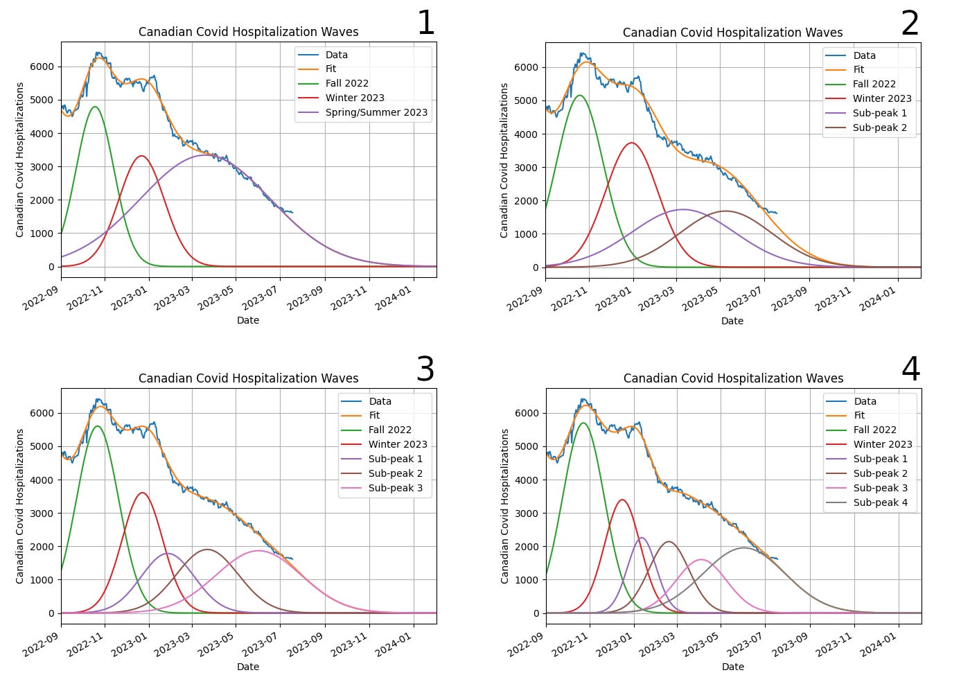
Someone asked at the time if the broad current peak could be due to multiple overlapping narrower peaks, more consistent with the peak width we've seen previously, and with the idea that what we're experiencing now is a "variant soup" of covid strains, all active at the same time and (re)infecting different groups of people. I said I'd look into that, and this is the result, assuming one to four peaks in the past few months:
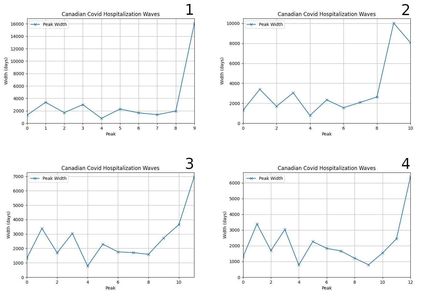
All the fits are pretty good, although I'll look at the actual RMS (root mean-squared) error below, which is a more objective estimate of fit quality. However, when we look at the widths of the sub-peaks that contribute to this wave, we can see that while the additional peaks are narrower than the single big one, they are still much wider than the previous average width. Adding more peaks does not make this phenomenon of recent peaks becoming broader go away:
Observe that the graphs don't have the same scales on the Y-axis, something I only noticed when I put them together into one image, and that I'm too lazy to go back and fix. The bottom two graphs have Y-ranges that are about half that of the top left. Have a look at the numbers and adjust your eyeballs accordingly.
What I did next is aimed at figuring out what--if anything--these different fits mean.
The kind of fitting that I'm doing to extract the peaks depends on the fitter being "seeded" with the peaks I'm looking for. Every peak has three parameters--position, width, and area--so to add an additional peak I pass three more parameters to the fitter. The objective function, which computes the difference between the data and the fit for a given set of parameters, adds these to its repertoire.
This process of non-linear fitting is inherently ambiguous. The fitter will dutifully find the best match between any function and any data that's fed into it, and with enough parameters it will happily prove von Neuman was right when he said, "Give me four parameters and I can fit an elephant. Add a fifth and I can make the elephant fly."
This is one of the things that makes science more of an art than a science: there is no substitute for taste and good judgment, which also means there's ample ambiguity, and room for all kinds of messy and complex, but still good-faith, disagreement.
Non-scientists, especially philosophers and other charlatans, have for centuries been selling a caricature of science, which persists to this day among laypeople. "Scientific objectivity" gets conflated with "not having any personal opinions", which completely misses the point: the sole purpose objectivity is to reduce confirmation bias. That's it.
A scientist can have all kinds of opinions and biases in their approaches--its one of the reasons why we have different sciences in the first place, because some of us are excited by atoms and some of us by diatoms. I'm a computationalist because I like code and an experimentalist because I like to get my hands dirty. I dabble in theory now and then because everyone has to, but it's not where my heart is.
Objectivity is the art of avoiding analytical choices or theoretical approaches that are selected for the purpose of producing the outcome we want.
Anyone who tells you otherwise is probably engaged in a straw person kind of argument, where they want to sell you some "alternative" to their caricature of "Western science". Don't fall for it.
Science is the discipline of publicly testing ideas by systematic observation, controlled experiment, and Bayesian inference, and updating how plausible we think they are on that basis.
It's a discipline, a lived practice, not a method. The epistemic arts, which create knowledge, are no different than the martial arts, which create unconscious people, or broken bones, or whatever: there are many ways of doing it, they each have their strengths and weaknesses, and it's possible to practice any of them in a rote and mindless way, which is also true of the disciplines of science. That potential for rote mindlessness gives rise to a certain stodgy type of individual who proclaims that one particular way of doing things is "the scientific method", which unfortunately is fodder for the charlatans who want to discredit the discipline of science as such. In fairness, if all science was was a single rigid rote method I'd want to discredit it too. But it isn't.
My own bias in the case of non-linear fitting is to keep the number of parameters to a minimum. Every additional fit parameter is an opportunity to let confirmation bias sneak in, and can result in "over-fitting" where the extra parameters compensate for "noise", which is just a name for "everything that influences these numbers except the thing I care about".
But it's also possible to have too few parameters, resulting in an overly stiff fit that fails to account for the data, slicing off important features in the best procrustean fashion.
Ergo: taste and good judgment.
In this case, there are multiple factors to look at. The initial motivation for this work was asking if we can make the current peak look more like a combination of overlapping peaks that are similar to what we've seen before? The answer is "No" because the current decline in cases implies a broad underlying structure.
There's no real way to reproduce that without a much more elaborate and fine-tuned collection of smaller peaks, and I'm not willing to go there because there's no warrant for it, no justification. If I just use five peaks with their width fixed at the average value of the preceding peaks it produces a visibly lumpy structure that deviates significantly from the data, as shown here. The RMS error is significantly worse (170 vs 110 for the same number of sub-peaks but variable-width) and even the Mark I eyeball can see the difference between the data and fit:
Still, it's interesting to look at what the other effects of the different peak numbers is, particularly the peak spacing and the infectiousness.
On the one hand, the peak spacing looks increasingly unnatural as we go to higher numbers, although this almost by necessity: the more peaks we cram in over the past six or nine months the smaller the spacing is going to be. But the small spacing for the first of the extra peaks tells us that we really are "cramming them in": they are being squashed between the last "normal" peak and the fat current peak. It looks cramped:
As the number of peaks increases the spacing starts to dip down below 50 days, which is something we otherwise don't see, and it only rises again as the fatness of the current peak pushes things outward.
So adding peaks doesn't fix the "broad peak" problem (insofar as it is a problem) and introduces spacings that are shorter than we've seen previously. Omicron peak spacing bounces around between 2 - 3 months, consistent with immunity waning on a few months timescale. If we assume the current broad peak is made up of many sub-peaks, we're also assuming they are closer together than we've seen before. We can't get a good fit otherwise. Which is fine, but we're just trading one anomaly--the broad current peak--for another.
The use of Gaussian peaks the way I'm doing here is what is sometimes called "semi-empirical". SEIR models do produce peaks that are pretty Gaussian in most cases, but we're making a strong assumption that that is the case. Because the peak parameters don't have any especially transparent meaning in terms of the dynamics, it's worth asking what the addition of sub-peaks in the current waves does to the pandemic parameters, which do have dynamical as well as biological meaning. When we look at them, we see something that is interesting:
The infection probability remains pretty much constant in all cases, but if we have more than one peak in the current wave the hospitalization probability stays flat. The probabilities are extracted from the peaks by fitting a SEIR model to them, and the only way to fit a single fat peak is if we have fewer cases at any given time that are more likely to end up in hospital. But with more peaks, even though they're fatter, they aren't fat enough to require this kind of big shift in the underlying dynamics.
So our choice of the number of peaks affects our conclusions about the dynamics.
Ergo: ambiguity abounds.
I love dynamical modelling and its power as a tool for understanding reality, but every tool, every epistemic art, has weaknesses as well as strengths. This is the weakness of using dynamical modelling the way I am: reality often under-determines the model, even when the model itself has only two free parameters.
In the current case, the problem is not with the dynamical model, but with the semi-empirical fit. One way of resolving this kind of ambiguity is to look at how the quality of fit changes with the number of fit parameters.
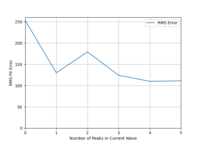
To look at that, I've computed the RMS error from September 1, 2022 to the most recent date in the data (July 18, 2023 at the time of this writing). This overlaps with where the current wave has significant presence. And to ensure I'm doing a fair job, I've looked at the case where there are only nine waves, not ten, so the ninth wave, which started back in the summer of 2022 and in the ten-peak model dies out by the end of winter 2023 has to cover everything in the past six or nine months:
I also looked at the case where there are five subwaves, rather than just the limit of four used in the preceding analysis:
This is how the error goes:
This does not encourage me to add more than one peak to the current wave.
Going from no peak dedicated to this wave to one peak drops the error from 253 to 130, which is substantial. Then the error bumps up to 180 for two peaks, and after that bops around between 110 and 130.
As a general rule of non-linear fitting, it's best to stop adding parameters when the big gains in RMS error have been achieved. That is clearly at the level of "one peak in the current wave".
Does this mean it is "100% certain for sure" that we're making the right choice to stick with one peak?
Nope.
Science is about embracing uncertainty. Making friends with it. Taking it out for beer.
That's where we are with this analysis: to someone with my bias toward minimizing the number of parameters, a single peak in the current wave is the preferred fit. That means that the odds of hospitalization are about four times higher than they were in previous waves, consistent with the effect of multiple reinfections on the general population. In fact, it would be kind of odd if covid infection didn't result in a higher rate of hospitalization in populations where covid has been allowed to run free for the past three years.
It's generally a good idea to push the envelope of analysis like this, and figure out where the boundaries are. That takes time, but it's worth it if you are practicing the epistemic arts that are most likely to win this kind of fight. Eliminating the peak dedicated to our current wave is clearly a bad idea, and adding more peaks gains us very little at the cost of significantly increased complexity in the fitting function.
Ergo: we are stuck with a single peak, much higher hospitalization, and slightly lower infectiousness.
And if you look carefully at the peak graphs, you'll see the data are starting to depart from the fit in the past few weeks. I’ve updated the graph below a few hours before this goes live, and you can see the trend has continued. Based on the tail end of past waves, when the deviation exceeds 500 it is a strong indicator that we are back in a growth phase, with the next wave is already rising even as the current one ebbs. I’ll send out a short post when that happens, likely in the next week or two (data are only updated weekly on the Government of Canada website I’m pulling from, usually late in the day on Thursday).
Stay safe out there.


Thank you for this update …and your regular reminders that Covid is an ongoing reality.