


Spring 2023 Canadian Covid Update
something is going on

I'm taking a break from my theory of the modern world this week to give a covid update.
Over the past few months I've noticed a marked change in the character of the Canadian covid hospitalization count.

Since around the turn of the year we've gone from a series of fairly definite waves to what looks like a series of linear declines, at least to my unaided eye. Since it's hard to get linear slopes from exponential dynamics, this made me suspicious that the data were being manipulated.

I'm not a data forensic person: my autistic brain is not good at following the weird byways of neurotypical lies. I have a hard enough time decoding more-or-less honest neurotypical behaviour, and the kind of systemic dishonesty implied by manipulating data is unfathomable to me.
But I looked more closely, and found something even stranger.
My first approach was to go back to the crude peak-stripping model I was using last year, fitting the observed data to a series of Gaussians. This did very well in the past, and it does very well now:

It's immediately apparent that despite the odd shape of the current decline, it is plausibly due to exponential processes. The sum of the last two or three waves has been such that their result is approximately linear.
This doesn't "prove 100% certain for sure" that the data aren't being manipulated, but it makes it less plausible. That's a good thing.
So I went from believing the most plausible thing was fraud to believing it probably wasn't fraud, which left me without any good idea of what it was.
The right thing to do in such a case is almost always the same: look more closely.
But how? The raw parameters of the peaks are not meaningful in terms of viral dynamics, which is what I'm interested in. I'd like to know what changes in the virus might explain the change in the data.
At a glance the most recent peak shows that it's wider than all previous ones by quite a margin. Plotting the width, height, area, and spacing of the peaks shows various trends and anomalies:


The width of the most recent peak is up by almost a factor of three from previous peaks, even while its height continues the general downward trend since the first omicron peak. This combination produces an area that is larger than anything seen previously.
To figure out what this might mean in terms of viral dynamics I used a variant on the SEIRS model I developed previously, limiting it to a SEIR model in which people move from Susceptible to Exposed to Infected to Recovered, and never become susceptible again, so we drop the final "S", and analyzing the Gaussian peaks I’ve extracted from the data, not the data itself. This model generates individual waves that rise and fall back to zero, not ongoing oscillations like those produced by a full SEIRS model, in which immunity wanes.
By treating each extracted peak as its own mini-pandemic I can simplify the analysis a great deal and ask if the viral parameters change from peak to peak: the model runs until there are too few susceptible people to sustain the pandemic. It turns out this is something like half of all people getting infected every wave.
This is like doing a reset on the population between waves, where either because of waning immunity or new variants the whole population has time to become susceptible again. While not an obviously realistic scenario, it turns out that it fits the data remarkably well.
Even granted that the model is a simple one, half the population per wave is a very high fraction. Curiously, number of people who are actively infectious on the day the worst waves peak is 1 in 12, dropping to 1 in 20 in recent waves, and lower still in the current one. These numbers not insanely far off the empirical estimates that Professor Moriarty's lab at the University of Toronto are producing, although they do trend higher. In reality the population is not homogeneous, and Prof Moriarty's numbers reflect that, while the model doesn't. This suggests that within some sub-populations the infection rate is likely to be much lower than the average, and in others it will be much higher. The relative size of these sub-groups may be what accounts for the difference between Prof Moriarty's real-world numbers and my theoretical ones, I think. But still: for biology, this is pretty good agreement.
I've also simplified the SEIR model by reducing the number of free parameters to just two: the probability of getting infected when someone encounters a person with active covid, and the probability of someone who gets infected ending up in hospital. The two other parameters, which are the time between exposure and becoming infectious and the time between exposure and recovery, I've frozen at the values I get from the first nine peaks when doing a full fit with all four parameters.
The reason for this is that the Gaussian peaks, which is what we're trying to fit, have only two parameters that fully characterize them: their width and their area. The peak position is forcibly matched during the fitting process, so it drops out. As such, I want a dynamical model with at most two parameters. Having more model parameters than peak parameters dilutes the meaning of each parameter and makes the model harder to interpret. Remember, the goal here is to use these tools to help us think about a complex reality, so the fewer parameters we can get away with the better off we are in terms of ease of thought, so long as we don’t have to burn too much accuracy.
Furthermore, the time parameters are somewhat redundant with the probability parameters. That is, a longer infectious period has a similar (although not identical) effect to having a higher infection probability, as does a shorter time from exposure to becoming infectious.
Finally, we know from empirical data that the time from exposure to infectious is in the range of 2-3 days, and from exposure to recovery around 10 days (for a ~7 day infectious period). Using this information we can get a stronger sense of what's happening with hospitalization risk and infectiousness, where a clear pattern emerges showing how different the current peak is, as shown by the following two graphs, the first showing infectiousness, the second hospitalization risk.
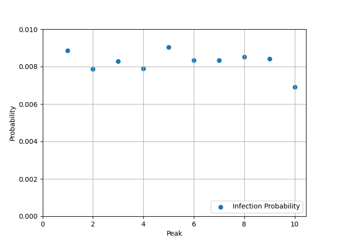
1) Infectiousness is about 10% lower in the current wave, so it is marginally less likely that people will get sick.

2) If you do get sick, the risk of ending up in hospital is about a factor of 4 higher in the current wave compared to previous ones.
And, as noted above, this produces a peak that has the largest area--the most people in hospital for the longest time--of any so far.
But... am I justified in freezing the time parameters?
Any time you freeze a parameter you want to know two things: Can you still get a good fit? And does the quality of the fit depend sensitively on the specific value you choose for the frozen parameter?
If the answer to the first question is YES and the second question is NO, then freezing the parameter is justified: it's just a nuisance factor.
This is the case here: the fit actually improves for a few cases with just two parameters because the fitter doesn't get stuck in awkward local minima in the more complex space it has to deal with in four dimensions.
The fitter is programmed to minimize the root-mean-square (RMS) error between the data and the SEIR model result, and going to two parameters does a reasonably good job, although the 2-parameter fit struggles a bit with the first omicron peak (peak 5) and the 4-parameter fit lands in some kind of local minimum for the current peak:

I also tried different values for the two fixed times, ranging the exposure time from 2 to 4 days and the infectious time from 8 to 12 days. The pattern of behaviour is the same in all cases: infectiousness (not shown) drops by a bit, hospitalization goes up by a lot:

That's a robust result.
Curiously, if I try the opposite--freeze infectiousness and hospitalization risk, and leave the times free--the fit is terrible. This might be a problem with the fitter, as nonlinear fitters are always a bit finicky, but I've been using this one for a long time and it generally produces pretty reasonable results.
As one more check, if I compare the infection probability and hospitalization risks to what I got running a full omicron-era model, the first nine peaks give the probability of catching covid from someone you encounter who is infected at 0.87%, which is reasonably close to the value of 1.17% found in the full fit, and the fraction hospitalized is in the range of 0.20-0.25% in both cases.
It is quite remarkable that such different treatments of the data produce such similar values for these characteristics of the virus: 1% infection risk, 0.2% hospitalization risk. Until the current peak, where hospitalization risk goes to 0.8% and infection risk barely changes.
Which leaves me with the question of "What is the cause behind the cause?"
Assuming we're entering an era of ten percent lower infectiousness and four hundred percent higher hospitalization risk, how come?
The model is really only sensitive to infection probability times number of contacts per day. The model assumes 20 contacts per day on average. If that had gone down to 18 it would explain the effect.
The higher rate of hospitalization is consistent with the data showing that all-cause hospitalization risk goes up with each infection, at least for older white men, who might not be all that special in this regard. Without infection about one in twenty will end up in hospital in any given year. After the first infection it rises to one in twelve. After the second to one in four, and it continues to rise after that.
A factor of five increase in risk is in the right ballpark. If the overall hospitalization risk rises significantly after several infections, why wouldn't the covid hospitalization risk rise by a comparable factor? It's not like there's robust, lasting immunity, and we know the virus damages the immune system and poses a risk to any organ that requires blood.
So that's depressing.
This is what "living with covid" looks like: slightly reduced social contacts and/or marginally lower infectiousness, the virus still spreading freely, and higher odds of being hospitalized with each infection. Meanwhile, new variants are evolving all the time, and immunity still wanes in a few months, unsurprisingly.
Wearing an N95 or elastomeric respirator indoors in public is effective at protecting you from it until we update building engineering standards for airborne infection control and implement, which is the work of generations, unfortunately, in part because "infection prevention and control" is currently mostly in the hands of physicians and public health bureaucrats none of whom have any training in fluid mechanics or HVAC equipment. This means we (engineers) first have to win a turf war, because those physicians absolutely do not care how many people die or are disabled so long as they can maintain their fiefdom.
The code I've used to generate these graphs is available on github. Feel free to download and play with it. Ping me if you've got questions, although my time is fairly limited.
In the meantime: stay safe, enjoy life, and remember the people who are out there actively minimizing covid, dismissing N95s as useful mitigations, and opposing the engineering upgrades that could have gotten us out of this mess already if we'd started on them three years ago. Covid won't be over until all of those people are out of positions of power. Let's use what democratic influence we have to make that happen sooner rather than later.
Thanks for the update, Tom! So few people are wearing masks these days, it’s depressing.
Thank you for once again spelling out the state of Covid in Canada and what needs to be done.